VASSAL Reference Manual
Home > Module > Game Piece Image Definitions > Game Piece Layout > Game Piece ImageGame Piece Image
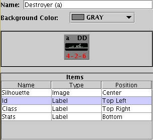
| Name:
Specify a name for the image definition. This is the name under which
this image will appear in the image-chooser drop-down menu in a Game
Piece trait's properties. Background Color: Select a background color for the image from the drop down list of available colors. The next section shows a visualization
of what the finished image will look like with your choices.
The Items panel shows the configurable items that make up your image layout. Click on an item to display the configurable options for that item in the bottom display panel. There is a different display panel for each type of item.
|
 |
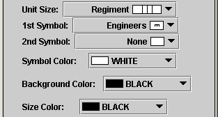
Symbol Item Configuration
|
Unit Size: Select the NATO Unit Size
specifier from the drop-down menu.
|
|
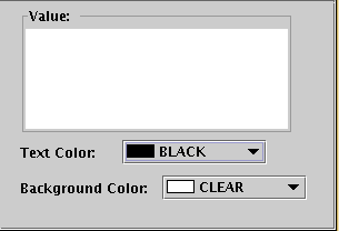
Label Item Configuration
|
Value: Enter the text to display on the
image.
|

|
Text Box Item Configuration
|
Value: Enter the text to display on the
image.
|
|
Image Item Configuration
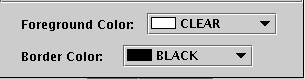
Import an image to draw at the position specified in the layout.Shape Item Configuration
|
Foreground Color:
Select the fill color for the shape.
|
|