Game Piece Layouts
This component contains all the
layouts used to define a Game Piece Image.
Right-click and select "Add Game Piece Layout" to add a
new layout.
A Game Piece Layout defines the general look and layout of the
items used in drawing an image. Specific color and text information is
defined for individual counter images in an Image Definition.
|
An Image is built up by drawing in order:
- A rectangle of the
background color.
- A border.
- Each defined item in
the
order displayed in the Item panel.
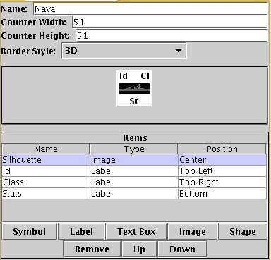
Name: The name of the Image Layout.
Counter Width: The width of all counters
created
using this layout.
Counter Height: The height of all counters
created using this layout.
Border Style: The border style for all
counters created using this layout. Border styles currently available
are:
- None - No Border
- Plain - Single pixel
line
of defined color.
- Fancy - Two pixel
shaded
line of defined color. Mild 3D effect.
- 3D - A 3D-style
shaded border. Two pixels wide, colour automatically determined from
background color.
Reduce Images to 256 Colors: This option results in smaller module files and will not degrade image quality unless the counters use high-resolution photographic images
|
|
|
The
next section contains a visualizer, showing you in actual size what
your finished counter will look like. No colors or text have been
defined yet, so sample text values and images placeholders are
displayed.
|
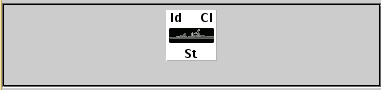 |
Item List
|
The
Items panel shows the list of defined items for this Layout. Layout
items are drawn onto the counter image in the order specified. Click on
an item in the panel to display and edit its attributes in the lower
display panel.
|

|
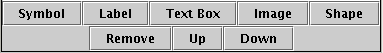
Buttons
|
Use the buttons to add, remove or move Items in the
list.
- Symbol - Add a NATO
Unit
Symbol.
- Text - Add a Text
label.
- Image - Add an image
from
the module images directory.
- Shape - Draw and
color fill
a rectangle, rounded rectangle or oval.
- Remove - Remove the
selected Item.
- Up - Move the
selected Item
up the list (i.e. draw earlier).
- Down - Move the
selected
Item down the list (i.e. draw later).
|
 |
Symbol Item
|
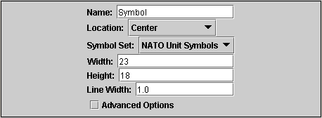
A Symbol Item is a generic symbol to be drawn by the
program. The particular symbol is chosen in the Game Piece
Image.
Name: The name of the Item. Items MUST
be uniquely named within an Image Layout.
Location: Select the location of the item
on the
counter.
Symbol Set: Select the Symbol Set to use.
Only
Symbol set available currently is NATO Unit Symbols.
Width: The width of the body of the symbol
in
pixels.
Height: The height of the body of the
symbol
(not including the Size specifier) in pixels.
Line Width: The width of the line (in
pixels)used to
draw the symbol. Fractional line widths can be used. The lines are
drawn with antialiasing turned on to produce smooth looking lines of
any width. When using a small symbol size, a line width of 1.0 will
usually give the best results.
|
 |
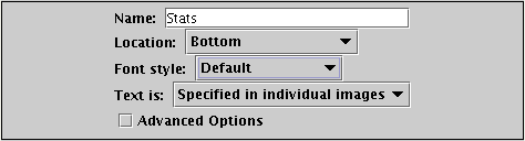
Label Items
|
A Text Item is a text label drawn in a particular font
at a particular location. The value of the text can be specified
in the individual images or in the layout, in which case all images
using this layout share the same value.
Name: The name of the Item. Items MUST
be uniquely named within an Image Layout.
Location: Select the location of the item
on the
counter. The location also determines the text justification,
i.e. selecting Top Left ensures that the upper left corner of the text
is in the upper left corner of the image. Once the justification
is set by the Location, you can still use the X/Y offset in the
advanced options to place the text in a different location.
Font Style: Select the name of the Font
Style to
be used for this Text Item.
Text is: Select whether
the text is specified in the layout or in the images.
|
|
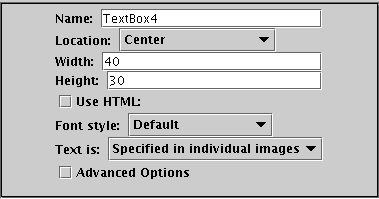
Text Box Items
|
A Text Box Item is multi-line area of text drawn in a particular font
at a particular location. The value of the text can be specified
in the individual images or in the layout, in which case all images
using this layout share the same value.
Name: The name of the Item. Items MUST
be uniquely named within an Image Layout.
Location: Select the location of the item
on the
counter. The location also determines the text justification,
i.e. selecting Top Left ensures that the upper left corner of the text
is in the upper left corner of the image. Once the justification
is set by the Location, you can still use the X/Y offset in the
advanced options to place the text in a different location.
Use HTML If selected, then the contents will be interpreted as HTML.
Font Style: Select the name of the Font
Style to
be used for this Text Item.
Text is: Select whether
the text is specified in the layout or in the images.
|
|
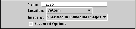
Image Item
|
An Image item is an imported image.
Name: The name of the Item. Items MUST
be uniquely named within an Image Layout.
Location: Select the location of the item
on the
counter.
Image is: Specify whether the image is
specified in this layout or in the images that use this layout.
Use
the File
Open Dialog box to locate a copy of the image you wish to use on your
PC. When you save the module, VASSAL will attempt to copy this image
into the images folder within the module zip file. You can
also manually copy images into your images folder.
|
|
Shape Item
|
A Shape Item is a simple geometric shape.
Name: The name of the Item. Items MUST
be uniquely named within an Image Layout.
Location: Select the location of the item
on the
counter.
Width: Select the width of the shape.
Height: Select the height of the shape.
Shape: Select the type of shape.
Bevel: For Rounded Rectangle shapes,
larger bevel values mean rounder corners.
|

|
Sub-Components
An image using this layout.
|