VASSAL Reference Manual
Home > Module > Map WindowMap Window
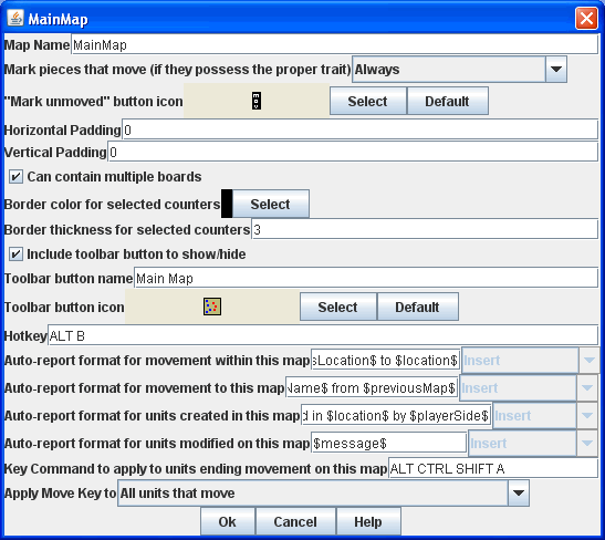
Map Name The name of this map window
Mark pieces that move If checked, then any pieces with the "Can be marked moved" trait will be marked whenever being moved in this map window. The module designer can also allow players to set this option in their preferences.
Vertical/Horizontal padding The amount of blank space surrounding the boards in the window
Background color: The color to use in the blank space padding
Can Contain Multiple Boards If checked, this map window can contain several boards arranged into rows and columns
Border color for selected counters The color of the border to draw around pieces that have been selected
Border thickness for selected counters The color of the border to draw around pieces that have been selected
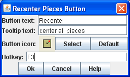
Include toolbar button to show/hide If checked, then this map window will not be automatically shown when a game begins. Instead, a button to show/hide this window will be added to the main controls toolbar
Toolbar button name The name of the show/hide toolbar button
Toolbar button icon An icon for the show/hide toolbar button
Hotkey The hotkey for the show/hide toolbar button
Auto-report format for movement within this map A Message Format that will be used to report movement of pieces completely within this map window: pieceName is the name of the piece being moved, location is the location to which the piece is being moved (in the format specified above), previousLocation is the location from which the piece is being moved.
Auto-report format for movement to this map A Message Format that will be used to report movement of pieces to this map window from another map window: pieceName is the name of the piece being moved, location is the location to which the piece is being moved (in the format specified above), previousLocation is the location from which the piece is being moved, previousMap is the name of the map from which the piece is being moved.
Auto-report format for units created in this map A Message Format that will be used to report pieces that are dragged to this map window directly from a Game Piece Palette: pieceName is the name of the piece being moved, location is the location to which the piece is being moved (in the format specified above).
Auto-report format for units modified on this map A Message Format that will be used to report changes to pieces on this map: message is the text message reported by the Report Action trait of the game piece being modified.
Sub-Components
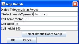
Map Boards
| This component contains
all the boards that may appear in this map
window. It contain Board
components and defines the dialog that is used to select boards when a
new game is started. Dialog Title: The title of the dialog window for choosing boards on this map. "Select Boards" prompt: The prompt message in the drop-down menu for selecting boards Cell scale factor: The relative size of the boards in the dialog compared to their final size during play. Cell width: The width of a cell when no board has been selected. Cell height: The height of a cell when no board has been selected. Default Board Setup: Hit this button to choose a default set of boards. When a default has been set, the dialog will not be shown to players when a new game is begun. Instead, the game will always be started with the boards you select. If you hit this button and then clear the boards, then dialog will again be shown at the start of each game. |
 |
Stacking Options
This component controls how stacking is handled in this Map Window. It may not be removed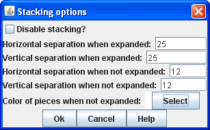
Disable stacking: If checked, then pieces will never form stacks in this window
Horizontal Separation when expanded: The distance in pixels from the left edge (right edge if negative) of a piece in a stack to the edge of the piece above it when the stack is expanded.
Vertical Separation when expanded: The distance in pixels from the bottom edge (top edge if negative) of a piece in a stack to the edge of the piece above it when the stack is expanded.
Horizontal Separation when not expanded: The distance in pixels from the left edge (right edge if negative) of a piece in a stack to the edge of the piece above it when the stack is compact.
Vertical Separation when not expanded: The distance in pixels from the bottom edge (top edge if negative) of a piece in a stack to the edge of the piece above it when the stack is compact.
Color of pieces when not expanded: If set, then pieces below the top piece in a compact stack will be drawn as plain squares of this color and a black border. If not set (hit the "Select" button and cancel the color-selection dialog) then pieces will be drawn normally.
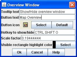
Overview Window
| Adds a separate window that will be
displayed whenever the main map window is displayed. The
additional window will contain a view of the entire playing area at a
smaller scale than displayed in the main map window. The area of
the map currently visible in the map window is highlighted in the
overview map with a colored rectangle. A player may click on the
Overview window to center the Map Window at the point clicked on. The scale of the overview window relative to the map window can be specified in the "Scale Factor" property. You may also specify the color of the rectangle indicating the area visible in the main Map Window. |
 |
Line of Sight Thread
| Adds a button to the toolbar of the Map
Window. Pushing the button will allow the player to drag the
mouse
between any two points in the window, drawing a line between those two
points. Hotkey: Specifies a keyboard shortcut for the button. Button text: The label on the button in the Map Window toolbar Draw Range: If checked, draws the range between the two points, in hexes or squares, as appropriate for the board in use. Pixels per range unit: If drawing the range on a board without a grid, this determines how many pixels on the screen equal a single unit of range. Round fractions: For distances that are a fraction of a range unit, specify whether to round fractions up, down, or to the nearest whole number. Hide Pieces while drawing: If checked, then all game pieces in the map will be hidden (or transparent) while the thread is being drawn. Opacity of hidden pieces:Set the transparency of game pieces while the thread is being drawn. 0 is completely invisible, 100 is completely opaque. Thread color: Specifies the color the thread on the screen. If set to null (by hitting the "Select" button and then the "Cancel" button in the color-choosing dialog), then a Preferences option will determine the color of the thread at game time. |
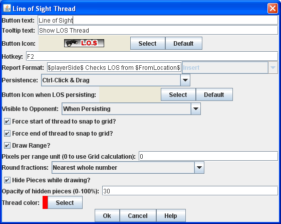 |
Toolbar Menu
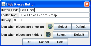
Groups buttons in the toolbar into a single drop-down menu.Hide Pieces Button
| Adds a button to the toolbar of the Map
Window. Pushing the button will temporarily hide all pieces on
the
map, until the button is pressed again. Hotkey: Specifies a keyboard shortcut for the button |
 |
Zoom capability
| Adds "Zoom in" and "Zoom out" buttons to
the toolbar of the Map Window. Keyboard shortcuts can also be
specified by filling in the "Hotkey" boxes. The "Zoom
factor"specifies the magnification factor for each zoom level, and the
"Number of zoom levels" specifies the maximum number of levels that may
be zoomed out. The "Starting zoom level" is the default zoom
level
when a game is loaded. |
 |
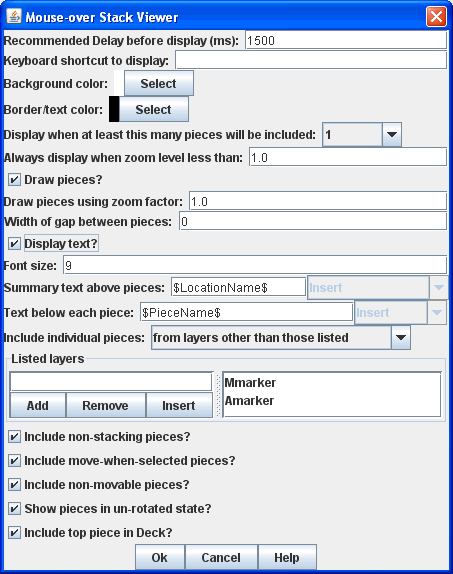
Mouse-over Stack Viewer
| Adds a tool that displays
the contents of a stack when the player leaves his mouse resting over
it, after a specified delay. Recommended Delay before display: When the mouse has been stationary for this many milliseconds, the viewer will appear. This can be overridden in the preferences. Keyboard shortcut to display: Players may display the viewer without waiting by typing this keyboard shortcut. This can be disabled in the preferences. Background color: Pieces/text are drawn against a background of this color. Border/text color: Color of any text drawn and the border around the overall viewer. Display when at least this many pieces will be included: If set to 0, then the viewer will display even if the location is empty. Otherwise, it will display only if 1 or 2 pieces have been included via the settings below. Always display when zoom level is less than: Regardless of the above "at least this many" setting, the viewer will also display when the map's magnification factor is less than this number. Draw pieces: If selected, then the included pieces will be draw in the viewer. Draw pieces using zoom factor: The magnification factor to use to draw the pieces in the viewer. Width of gap between pieces: Empty space in pixels to place between each drawn piece. Display text: If selected, then the viewer will draw some summary text and some individualized text for each piece. Font size: Size of the text to draw. Summary text above pieces: A Message Format specifying the text to display above the drawn pieces in the viewer. In addition to standard Properties, you can include a property with the name sum(propertyName) where propertyName is a property defined on a Game Piece. The numeric values of this property for all included pieces will be substituted. Text below each piece: A Message Format specifying the text to display below each included piece. Text for empty location: A Message Format specifying the text to display when no pieces have been selected. Include individual pieces: Specifies how pieces are to be selected for inclusion in the viewer. You may restrict the pieces according to the Game Piece Layer that they belong. Alternatively, you may specify the value of a Property. Include non-stacking pieces: If selected, then non-stacking pieces are eligible for inclusion in the viewer. Show pieces in unrotated state: If selected, then pieces that can rotate are drawn in the mouse-over as they look when not rotated. Include top piece in Deck: If selected, then the top piece of a Deck is eligible for inclusion. |
 |
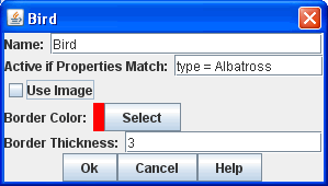
Last Move Highlighter
| Draws a colored border around the last piece to have been moved, added, or deleted in a logfile or by an opponent during live play. Color is the color of the border and Thickness is the border thickness. The highlight is cleared by clicking on the map. | 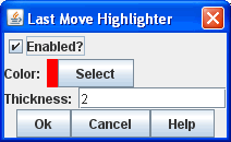 |
Game Piece Layers
Allows you to restrict Game Pieces to different layers on the
map. Pieces in higher Layers are always drawn on top of lower
Layers, and pieces never combine into stacks with pieces on other
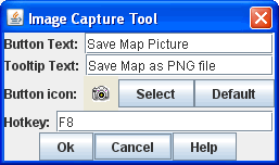
Layers.Image Capture Tool
| Adds a "Camera" button to the toolbar of
the Map Window. Pushing the button will dump the contents of the
Map Window to a image file. This allows you to take a screen shot
even if the map window is too large to fit entirely on the screen. |
 |
Text Capture Tool
| Adds a "Save Text" button to the Map
Window toolbar. Hitting the button will write a plain text
summary
of the contents of the map to a file, using the names assigned to the
counters and the appropriate numbering of the board's grid. |